Creating a population pyramid to visualize crime victimization by age and sex in Mexico
How to create a population pyramid using {ggplot2} in R
Overview
Population pyramids are a powerful way to visualize demographic data, especially when analyzing age and sex patterns. In this post, I will elaborate a population pyramid using the {ggplot2} package in R, specifically focusing on crime victimization data from Mexico’s National Survey of Victimization and Perception of Public Safety (Encuesta Nacional de Victimización y Percepción sobre Seguridad Pública, ENVIPE).
Set-up
First, we need to install and load the necessary R packages.
Loading data
I will use the data from the table Population aged 18 and over by state, age group, sex and victimization condition (Población de 18 años y más por entidad federativa y grupos de edad según sexo y condición de victimización) from the 2024 ENVIPE available here.
envipe_data <- read.csv("victimization-age-sex-Mexico.csv")Data looks like this:
envipe_data |>
  kbl(caption = "Prevalence of victimization by age and sex in Mexico, 2023") |>
kable_paper("hover", full_width = F)| Age | Prevalence | Sex |
|---|---|---|
| 18-19 | 25.7 | Men |
| 20-29 | 30.0 | Men |
| 30-39 | 27.3 | Men |
| 40-49 | 24.3 | Men |
| 50-59 | 20.9 | Men |
| +60 | 15.1 | Men |
| 18-19 | 26.6 | Women |
| 20-29 | 30.5 | Women |
| 30-39 | 27.1 | Women |
| 40-49 | 22.6 | Women |
| 50-59 | 19.8 | Women |
| +60 | 13.5 | Women |
Then, we use the {tidyverse} package to prepare the data for plotting.
Creating the population pyramid
First, we estimate the adjusted limits for the x-axis.
Then, I create a custom theme for the chart and set the font to “Libre Franklin” using the showtext package. More font options are available https://fonts.google.com/.
font_add_google("Libre Franklin", "Libre Franklin")

showtext_auto()

# Custom theme for the chart
theme_pyramid_chart <- function() {
  theme_minimal(
    base_family = "Libre Franklin"
  ) +
    # Custom theme settings
    theme(
      # remove grid lines
      panel.grid = element_blank(),

      # Axis settings
      axis.title.y = element_blank(),
      axis.text.y = element_blank(),
      axis.title.x = element_text(
        color = "white",
        face = "bold",
        size = 18
      ),
      axis.text.x = element_text(
        color = "white",
        face = "bold",
        size = 16
      ),

      # Title settings
      plot.title.position = "plot",
      plot.title = element_textbox(
        color = "white",
        face = "bold",
        size = 24,
        margin = margin(5, 0, 5, 0), # top, right, bottom, left
        width = unit(1, "npc")
      ),

      plot.subtitle = element_textbox(
      color = "white",
      face = "bold",
      size = 20,
      margin = margin(5, 0, 35, 0),
      width = unit(1, "npc")
    ),

      # Legend settings
      legend.position = "none",

      # Caption settings
      plot.caption = element_markdown(
        color = "white",
        face = "italic",
        size = 14,
        hjust = 0,
        margin = margin(50, 0, 5, 0) # top, right, bottom, left
        ),
      plot.background = element_rect(
        color = "#8C8D86",
        fill = "#8C8D86"
      ),
      plot.margin = margin(40, 40, 40, 40) # top, right, bottom, left
    )
}

title_chart <- "Crime victimization in Mexico | 2023"
subtitle_chart <- "Share of the population who were victims of crime by age group and sex"
caption_chart <- paste0("**Data:** 2024 National Survey of Victimization and Perception of Public Safety (ENVIPE)",
                        "<br>",
                        "**Chart:** Juan Torres Munguía")
Finally, I use geom_col(), geom_label(), and annotate() from the {ggplot2} package to design the chart.
envipe_data |>
  ggplot(aes(x = Age,
             y = Prevalence,
             fill = Sex)
        ) +
  geom_col(width = 1) +
  scale_fill_manual(
    values = c("Women" = "#E6C069",
               "Men" = "#8DAB8E")) +
  geom_label(
    aes(label = round(
      abs(Prevalence)-5, 1 # Round the figure
      ),
        y = Prevalence),
        color = "white",
        size = 5,
        fontface = "bold"
        ) +
  coord_flip(clip = "off") +
  annotate(
    geom = "text",
    x = 6.75,
    y = 7.5,
    label = "Men",
    size = 8,
    color = "#8DAB8E",
    fontface = "bold") +
  # Adding annotations for the sex of the victim
  annotate(
    geom = "text",
    x = 6.75,
    y = -9.5,
    label = "Women",
    size = 8,
    color = "#E6C069",
    fontface = "bold") +
  # Adding a rectangle at the center of the plot
  # This rectangle will containg the x-axis labels (plot is inverted)
  # and is included between -5 and 5 values of the y-axis (plot is inverted)
  annotate(
    geom = "rect",
    xmin = -Inf,
    xmax = Inf,
    ymin = 5,
    ymax = -5,
    fill = "#8C8D86") +
  # Labels for the vertical axis (age groups)
  annotate(
    geom = "text",
    x = c("18-19", "20-29", "30-39", "40-49", "50-59", "+60"),
    y = 0,
    label = c("18-19 \n years", "20-29", "30-39", "40-49", "50-59", "60 and \n older"),
    size = 6,
    color = "white",
    fontface = "bold") +
  # I manually added a -40, 40 range of values to include the space in the center
  scale_y_continuous(
    limits = c(-40, 40),
    breaks = prevalence_breaks_adjusted,
    # Labels are renamed to be linked to real values of the x-axis, removing the
    # space in the center
    labels = function(x) {abs(x) - 5}) +
  labs(
    title = title_chart,
    subtitle = subtitle_chart,
    caption = caption_chart,
    x = "",
    y = "Proportion of victims (%)",
    fill = "") +
  theme_pyramid_chart()
# Set the resolution of the image 320 dpi is for high-quality images ("retina")
showtext_opts(dpi = 320)
ggsave(
"pyramid-crime-mexico.png",
dpi = 320,
width = 12,
height = 9,
units = "in"
)
showtext_auto(FALSE) # Turn off the showtext functionality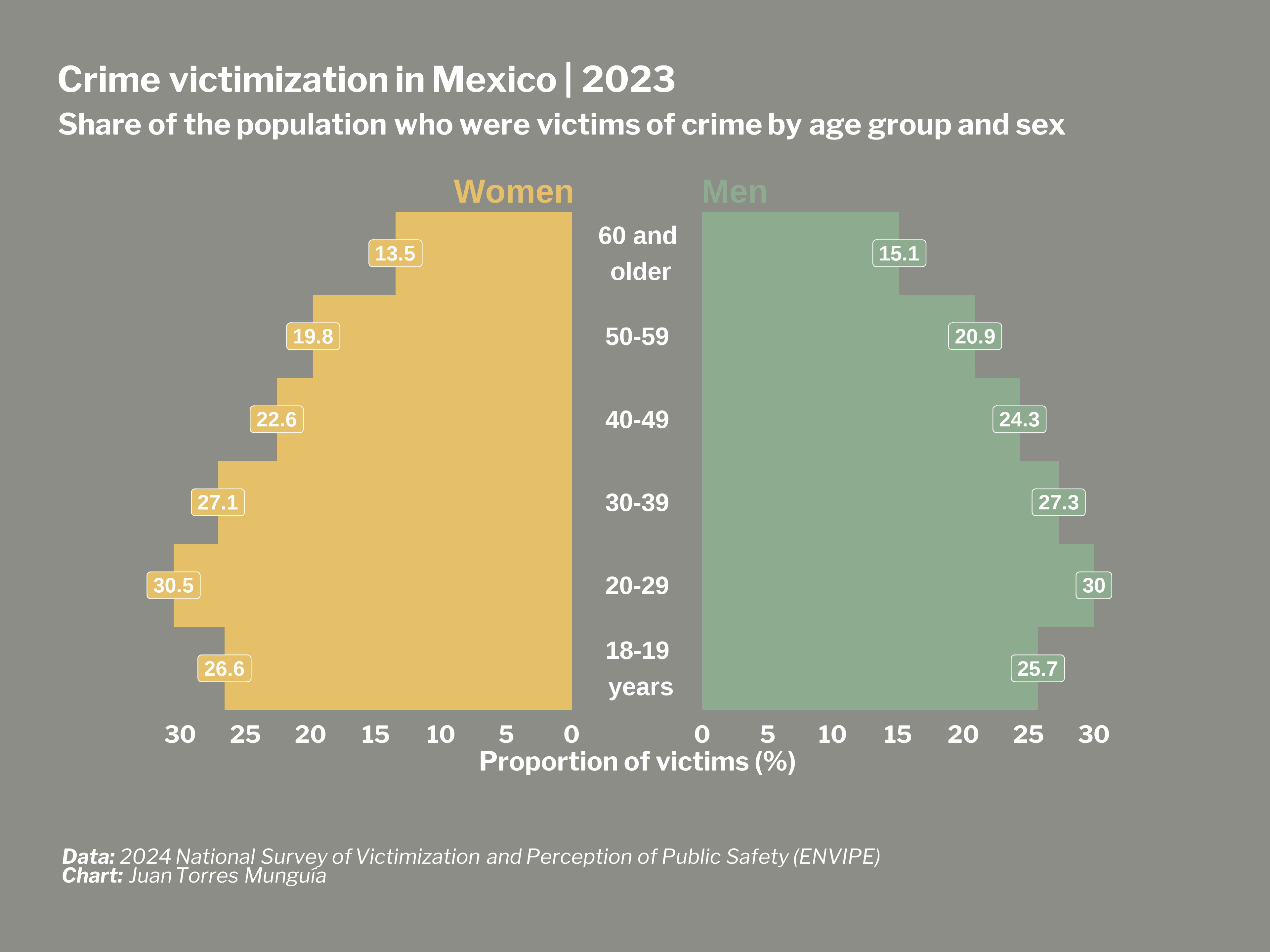
Citation
@online{torres munguía2025,
  author = {Torres Munguía, Juan Armando},
  title = {Creating a Population Pyramid to Visualize Crime
    Victimization by Age and Sex in {Mexico}},
  date = {2025-07-14},
  url = {https://juan-torresmunguia.netlify.app/blog/posts/population-pyramid-mexico-crime},
  langid = {en}
}